Build a repeatable system for agency client reporting with Claude
Published:
October 17, 2025
, Updated:
May 11, 2026
It's 9PM on a Sunday and you're reverse-engineering what "68% acceptance rate" actually means for the client call tomorrow morning.
You know this dance: copy campaign data into a spreadsheet, calculate reply rates, KPIs, then scramble for context on whether 4 meetings from 200 InMails is "good" or grounds for panic.
Rinse, repeat, for every client, every month.
For most agencies, client reporting eats 3–5 hours per client every month. That’s nearly a full workday gone to copying charts, formatting tables, and rewriting the same story 12 different ways. It’s exhausting and expensive. At $75/hour, that’s $3,000 in billable time you’ll never get back.
This guide gives you a reporting system you build one time (2-4 hours of setup), then execute in 45-60 minutes per client monthly. No more scrambling to remember how you calculated meeting rate last quarter.
You're getting six battle-tested assets:
A metrics translation dictionary that converts HeyReach's campaign analytics into answers clients actually asked for. A monthly report template designed for speed and consistency. A HeyReach export workflow using Workspaces and Dashboard features you probably aren't using. A performance narrative framework so you're never stuck staring at numbers wondering what story they tell. Benchmark context so you can confidently say "this is good" or "here's why we're adjusting." And a prerequisites checklist so you're not building on quicksand.
After reading this you’ll get: reports that take minutes instead of hours. Clients who trust your expertise instead of questioning your math. And Sundays that are actually yours again.
Let's build it together.
Why agencies still lose hours on manual client reporting
If your biggest time sinks are:
- Having too many data sources
- Re-formatting everything to match client branding
- Writing commentary and summaries from scratch
Then yes, this story is about you.
Every agency swears they’ve “streamlined” reporting… until Friday night rolls around and someone’s still copy-pasting from HubSpot into Sheets while the client’s Slack message says, “Can we get a quick update before Monday?”
Sound familiar? Yup, that’s you, (and me a few years back.)
It’s time to stop destroying client relationships because of reporting chaos that eats time, burns ops, and erodes trust.
Let’s break down the biggest drains.
1. Scattered data = scattered brains
You’ve got client data scattered across Google analytics, Power Bi, Notion and Tableau.
Every client onboarding meeting turns into a scavenger hunt across five tools, and your SEO reporting is now a full-time job.
2. The “translation gap” no one admits
You proudly tell a new client their acceptance rate hit 40%. They smile politely but what they really want to know is:
“Are we getting meetings?”
Clients often need the full narrative layer, a clear explanation of what the data means, if any changes occurred and why, which marketing platforms you are using, and actionable insights for the future. Good reporting is about translating the data insights into something meaningful for clients, as they value not just the key metrics but also the story behind them.
3. Reinventing the wheel, every month
If you don’t have a solid system, it means every report is rebuilt from scratch.
Wasting hours on marketing data collection, graphs, struggling with Looker Studio and data visualization, and re-explaining key metrics that should’ve been automated once? That’s lowkey self-sabotage.
Not to mention you are also losing money. Every hour you spend formatting slides or chasing missing metrics is an hour you’re not closing deals or growing accounts. Multiply that by every client you handle, and the cost adds up faster than you think. Is it worth it? You tell me.
4. Inconsistency kills confidence
One month it’s Google Sheets. Next month, it’s Airtable. Then, someone experiments with Notion dashboards that break mid-call.
When clients see inconsistent metrics or formatting, they start questioning the data and they question you.
The good thing is you don’t need a super fancy tool stack to fix this. The solution is creating a reporting system that connects the tools you already use.
Now let’s walk through how you can turn that chaos into clarity with a unified reporting framework that scales from 10 to 100 clients.
Your repeatable client reporting workflow — optimize reporting in layers
If you could automate ONE annoying step in your reporting workflow, what would it be?
I pick data collection. Doing it manually can get really annoying, really fast.
If you’re spending nights piecing custom reports together from Slack screenshots, HubSpot exports, search console, and a graveyard of Google Sheets, what you truly need is a reporting system that connects everything you already use.
Start by building a unified reporting schema; one structure that pulls campaign performance data, meetings, and client metrics into a single reporting dashboard. Once your data lives in one system, everything else (speed, consistency, trust) starts taking care of itself.
Now, let’s break down exactly how to do that.
Step 1: Standardize your schema (before you scale)
Chaos starts when every social media account manager in your marketing agency builds their own version of “reporting.”
I recommend locking in one consistent schema for all clients to prevent this.
Your schema becomes the foundation for every report, custom dashboard, or data sync.
Once you have this structure, it works no matter how many clients you have. You can learn more about how to standardize your reporting schema here.
Step 2: Connect your tools, not your tabs
If your tools are not connected, you might have a data orchestration issue.
Instead of toggling between dashboards, use automation to make your tools talk to each other:
- Push HeyReach data into Airtable, HubSpot, or Google Sheets via Zapier or Albato.
- Auto-generate dashboards in Google Data Studio or Notion views.
- Send highlights to Slack or email so clients get visibility without another call.
This is about saving time and building a repeatable reporting workflow that scales without extra headcount.
Step 3: Report in client language, not sales jargon
Clients care about results.
Instead of saying “Conversion rates improved by 8%,” say “We booked 40% more calls this week.”
That’s what builds trust and renewals.
Every metric should translate into a business outcome or KPI. That’s how your reporting evolves from “proof of work” to “proof of value.” Template-based insights are usually obvious and don't justify agency fees, but actionable insights about market changes, competitive shifts, and strategic pivots is what keeps clients long-term.
Step 4: Automate retention
A consistent reporting cadence that caters to your client’s needs is your retention engine.
When clients see predictable results on their marketing campaigns, they stop questioning your process and start doubling budgets.
Raw dashboards are still great for transparency, but clients hire you for the narrative: what changed, why it matters, what you’ll do next, and when it pays back.
Pick one tool for your specific needs. Make a template. Send the story.
Start small. Test your schema on three clients. Once it runs smoothly, expand. By the time you hit 50+ clients, your ops team will be spending less time on data analysis.
Here’s how to set up your repeatable client reporting workflow (and how to operationalize it in HeyReach).
Layer 1 – Set up Workspaces and dashboards for clean data flow
Clean data means fast reporting.
If you want your data to stop wriggling like spaghetti and start flowing like a system, you need a solid workspace structure as a foundation.
Workspaces are how you separate clients, isolate real-time data, and protect reporting accuracy. Every Workspace acts like its own sandbox:
- No cross-contamination. One client’s LinkedIn seat can’t mess with another’s campaign results.
- Complete visibility. Your Ops lead gets a Master View across all Workspaces, so leadership can see performance at a glance.
- Role-based permissions. SDRs, Ops Leads, and Client Managers each get access tailored to their job. Nothing more, nothing less.

Setting this up matters because when data is isolated, your dashboards become trustworthy. No more guessing whether a 28% conversion rate belongs to Client A or B. This is crucial for good Linkedin client management.
Pro tip: Use consistent naming from day one. This 5-second detail will save you hours later.
Formula: [Client]_[ICP]_[Month]
Example: AcmeCorp_CFOs_July
This makes your complex data export-ready, instantly searchable, and clean enough to automate later.
Once your Workspaces are organized and CRM data isolated, the next step is making those numbers mean something.
Layer 2 – Export and interpret metrics in minutes
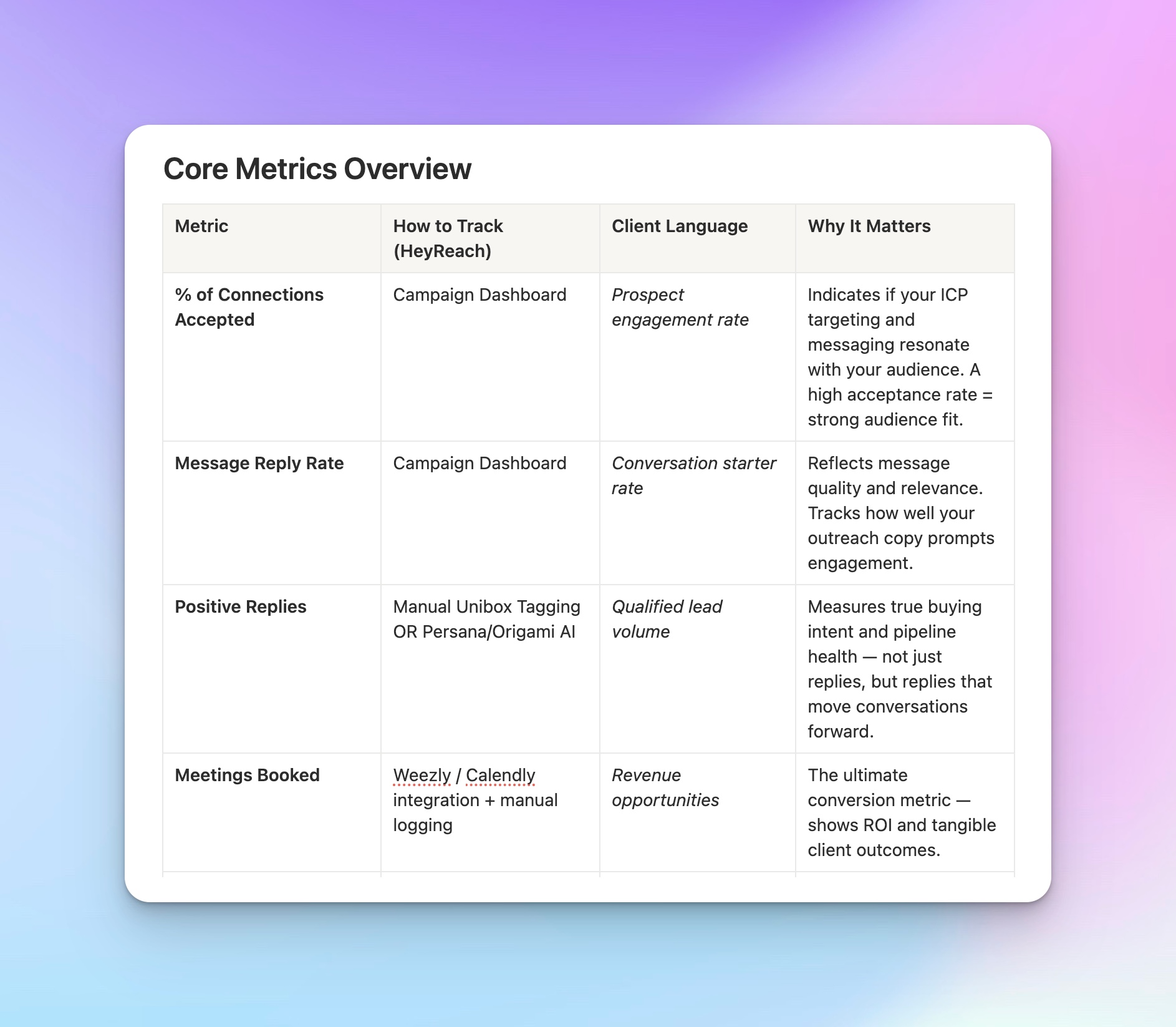
As much as clients care about metrics, they also care about the meaning of said metrics. All you need to do is pull the right numbers, translate them into human language, and do it fast.
Here’s the HeyReach dashboard workflow that will help with that:
- Switch to the correct Workspace.
- Filter by date range.
- Select campaign/sender.
- Hit Export CSV.
Simple. Repeatable. Reliable.
Implementation loop:
- Export HeyReach Dashboard CSV
- Color-code metrics by thresholds
- Tag clients Tier 1 / 2 / 3
- Drop Tier-specific paragraph into Slides or reports
For advanced teams using HeyReach MCP, tag leads by performance tier right inside the lead lists, no manual sorting needed.
Clients value three things in this order:
- "Is this working?" (connected to their bottom line)
- "Should we keep investing?" (ROI justification)
- "What do we do next?" (strategic recommendations)
Everything else is just noise that makes them question what they're paying you for.
Here’s how to reframe metrics into language your clients actually understand:
Once you know what to measure and how to frame it, it’s time to automate the story those numbers tell.
Layer 3 – Turn outreach metrics into automated performance reports
Start letting data write your first draft.
Your metrics already tell a story, all you need is a’drag-and-drop’ framework that turns them into repeatable, data-driven reports.
This framework ensures every report follows the same reasoning logic. By mapping your digital marketing performance metrics to these three narrative tiers, your team can standardize tone and focus, effectively replacing subjective “this feels good” commentary with objective, data-backed storytelling.
Use this simple 3-tier threshold matrix to standardize tone and narrative:

Implementation Workflow (Inside HeyReach)
- Export HeyReach Dashboard CSV and pull campaign metrics.
- Color-Code by Tier:
- Tier 1 = Green (Above Benchmark)
- Tier 2 = Yellow (Stable Performance)
- Tier 3 = Red (Corrective Action)
- Tag clients with corresponding tier in HeyReach or your reporting sheet.
- Insert tier paragraphs directly into client reports to standardize narrative tone.
- (Optional for MCP users): Tag individual leads by Tier 1/2/3 in HeyReach MCP, then filter reports by those tags to auto-populate and track performance insights. No need for manual sorting.
Now that your narrative is standardized, it’s time to package your reports in a way that scales with your agency.
Layer 4 – Deliver marketing reports that scale without losing context
Automation moves the data. Humans move the story.
You’ve already built the structure: Workspaces → Exports → Narratives. Now it’s time to streamline that system into a client-ready asset that looks consistent, feels personal, and scales across every account without losing context or tone.
Every scalable reporting system evolves through two modes:
Mode 1: Manual Reporting (Foundation Stage)
This is the craftsmanship phase where every report is hand-built by your team, close to the context and strategy.
You’ll refine your voice, and ensure every insight carries human judgment.
Manual Workflow
- Export metrics from HeyReach (Acceptance %, Replies, Meetings Booked).
- Drop data into your agency’s Slides or Notion template.
- Add narrative blocks using your Tier 1–3 reasoning matrix.
- Export as PDF → Email to the client.
Mode 2: Semi-Automated Reporting (Scale Stage)
Once your structure is stable, add light automation. This is not to replace people, but to give them leverage.
Use Make or Zapier to:
- Export HeyReach data post-campaign refresh.
- Auto-populate your Slide or Doc templates.
- Trigger “ready for review” messages in Slack.
The story stays human, but the delivery gets faster.
Please remember that automation shouldn’t replace your judgment.
Your storytelling still comes from the strategist; automation just moves the data faster. The goal is to deliver consistent, contextual client reports without doubling your workload.
But before you go full automation hero, learn from the scars; here’s what most agencies get wrong.
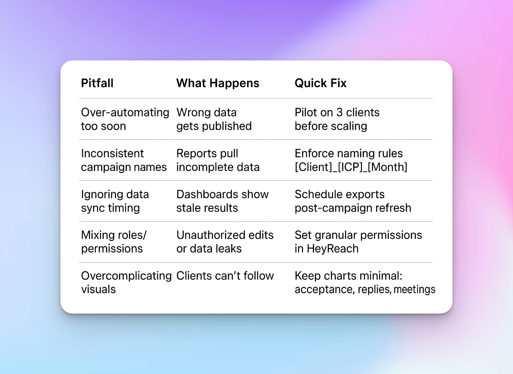
Common pitfalls to avoid in client reporting automation
In my personal experience, it’s better to automate structure, not sentiment. Let your systems handle things like scheduling, data integration, or follow-ups, but always review or personalize messages before they go out. Small gestures like a short note, a thank-you line, or a quick check-in remind clients that they're valued partners.
Think of automation as your competent assistant, not your voice.
Use this image as a guideline:
One final detail separates efficient agencies from the rest and it’s not automation.
It’s language.
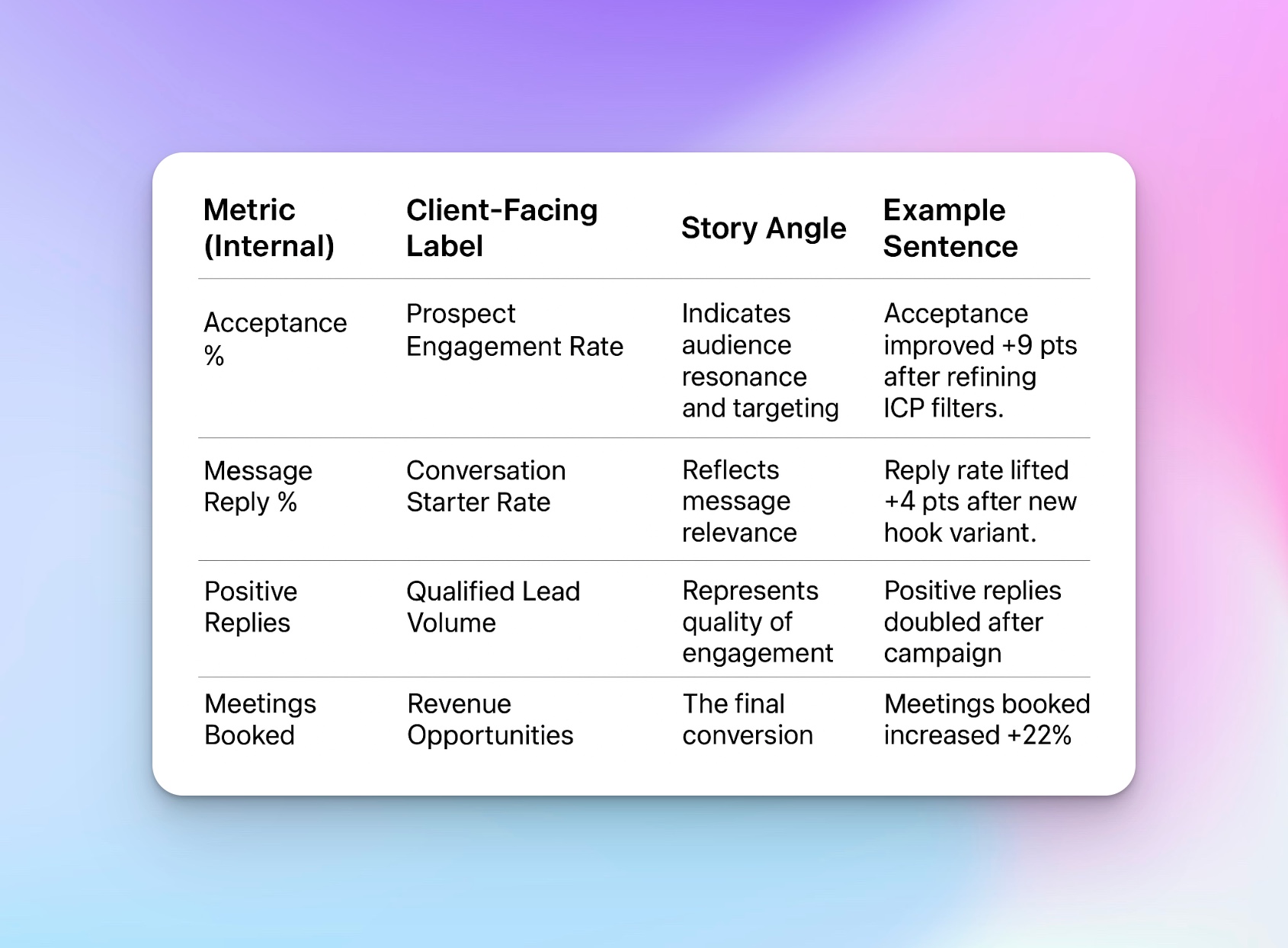
Standardize your reporting language
Inconsistent phrasing erodes trust. Clients subconsciously equate inconsistency with uncertainty. If one report says “Positive Replies” and another says “Qualified Conversations,” they wonder: “Are we tracking the same thing?”
Everyone’s technically correct but it’s still a disaster waiting to happen.
The solution is simply standardization. One shared vocabulary. Every metric should have a shared label, definition, and explanation across all workspaces, managers, and decks.
That’s why HeyReach teams build a Reporting Language Asset, which is a glossary that every CSM and strategist can reference.
It becomes the “source of truth” for:
- How each metric is named
- How it’s calculated
- How it’s presented to clients
- What story it supports in the narrative
Here’s a sample of how this might look:
Imagine a world where LinkedIn lead qualification isn’t your biggest problem. Instead you are battling translation issues. Is that better or worse, I honestly couldn’t tell you. When every Google ads, PPC, and ecommerce specialist in your marketing agency describes metrics differently (“response rate” vs “reply rate”), your clients get confused and your reporting loses authority.
Fix it by standardizing terminology across your agency → Get the full standardized reporting glossary
This small operational shift instantly makes your reporting scalable and positions your agency as data-driven, precise, and trustworthy.
Master View — Cross-client performance at a glance
Every top-performing agency I know has one rule: never fly blind.
If you’re running multiple client accounts, Master View is your control tower. It’s the single screen where you catch cross-client performance patterns, fix red flags, and make data-driven decisions before the month-end chaos hits.
Basically, it gives you a real-time lens across every client Workspace.
What the Master View Actually Does
Think of it as your mission control for performance intelligence.
It aggregates data from every client Workspace, giving you a real-time snapshot of total performance across your entire portfolio.
Here’s what that means in practice:
- See everything in one place: All campaigns, Workspaces, and sender activity, side by side.
- For reporting: You can instantly spot trends like,
“Three clients surpassed 20 % reply rate this month, what do they have in common?”
That gives you direction. - For operations: You can quickly identify outliers and take action:
“Campaigns under 10 % acceptance? Let’s re-allocate those senders or tweak ICP filters before next cycle.”
This is how agency owners get from reactive reporting to proactive growth management all without leaving the HeyReach ecosystem.
A Day in the Life of a Master View Check-In
Picture this:
It’s the final Thursday of the month. You open HeyReach, toggle into Master View, and instead of opening 10 separate dashboards, you see:
- 12 client Workspaces neatly aligned
- Red, yellow, and green indicators across acceptance, replies, and meetings booked
- A “Top Performers” column showing who crushed it this month
- A “Needs Attention” column where performance dipped below thresholds
In 10 minutes, you have your white-labeled reports with no spreadsheets or guesswork.
By Friday morning, your account leads already know which clients to celebrate and which ones need optimization.
Now, you can scale to dozens of accounts without losing the strategic thread.
Use Claude + HeyReach for cleaner client reporting
If Master View is your cockpit, Claude + HeyReach MCP is your co-pilot.
Once your agency is handling 10, 20, or 50+ client reports every month, human consistency becomes your biggest bottleneck. The HeyReach MCP (Model Context Protocol) integration turns AI into your reporting assistant — not to replace your judgment, but to ensure every report follows the same reasoning logic, tone, and structure across the board.
What MCP Actually Does
The HeyReach MCP acts as a translator between AI and your outbound tools.
The MCP protocol defines how large language models like Claude, ChatGPT, Gemini, and Perplexity securely exchange information with outbound tools, creating a standardized bridge between AI and real data operations.
It’s your quiet force multiplier: connect HeyReach to Claude or ChatGPT, and let MCP handle the mechanical part of storytelling while your team stays focused on insight.
Here’s how it transforms your workflow and changes the game:

A practical example: LinkedIn lead qualification
Let’s make it concrete.
Imagine your LinkedIn outreach campaigns are running across 12 clients. Some target founders, others mid-level ops roles.
By connecting HeyReach to MCP:
- You can auto-summarize performance by audience segment, highlighting which ICPs (e.g., “Operations Directors” vs “Founders”) show higher acceptance and reply rates.
- MCP can then generate tiered insights like:
“Operations leaders showed a 31% acceptance rate (+9 pts above benchmark). We’ll expand that ICP into two new verticals next month.” - Your ops team now has an actionable signal: “Prioritize LinkedIn lead qualification toward Operations Directors.”
This is data-informed storytelling and outreach at scale.
Learn more: LinkedIn outbound playbook
Get your client reporting templates and workflows ready for scale
Before you automate a single thing, lock in your structure. This checklist makes sure your reporting system scales without crumbling under version 12 of “final_final_v3.pptx.”
Reporting Readiness Checklist
- Create one Workspace per client. Isolation means clean data.
- Standardize naming. [Client]_[ICP]_[Month] (future you will thank you).
- Set Roles & Permissions: Admin = owner, Member = AMs.
- Build a Slides template with metric placeholders for consistency.
- Download your translation dictionary and narrative frameworks from the starter kit.
- Schedule your monthly export date (e.g., “1st of each month”).
- Run one full end-to-end test before going live. Time it.
If you can’t complete it in under 45 minutes, something’s overcomplicated.
This is your operational hygiene checklist. Without it, no amount of AI or automation will save you from chaos.
At this point, scaling from 5 clients to 50 just requires good replication.
Next Steps — Optimize your agency reporting process this week
You don’t need a 2-month roadmap. You can test this full system: Workspaces, metrics, reporting flow in three days flat.
Day 1: Foundation (≈ 1 hour)
- Create Workspaces for 2–3 test clients. Ideally one high-performing, one mid-tier, and one challenging account.
This gives you diverse data to test your structure. - Apply standardized naming: [Client]_[ICP]_[Month]
- Assign Roles & Permissions
Goal: Set your structure so every report starts clean.
Day 2: System Setup (1–2 hours)
- Build a Slides template with metric placeholders
- Copy your translation dictionary for consistency
- Export test data from the HeyReach Dashboard
Goal: Turn raw data into something readable and repeatable.
Day 3: First Live Run (≈ 1 hour)
Now that your system is structured, it’s time to run the first live test.
Your checklist for Day 3:
- Generate one full client report using your exported data.
- Apply your tiered logic (Tier 1/2/3) to choose the right narrative tone.
- Use your HeyReach MCP or manual prompts to create summaries faster.
- Add insights into your slide template and export as a PDF.
- Deliver the report to your test client or internal reviewer.
Then time yourself.
You’ll likely realize what used to take two hours can now be done in 20 minutes, and it looks better, reads smarter, and scales effortlessly.
Goal: Confirm your system works at speed and scale.
Start simple. As HeyReach’s best-performing partners have shown, clarity beats complexity every time.
Stop Drowning in Spreadsheets — Scale Client Reporting Without Losing Your Mind
Let’s be honest, you didn’t build your agency to spend your Fridays buried in 12 tabs of CSVs. Yet here we are: trapped in spreadsheet hell, endless “final_v6” reports, Slack messages asking “is this the latest version?”, and clients wondering why their dashboards don’t match the story you told them last month.
Chaos doesn’t scale. You can’t grow a 100-client agency on color-coded Google Sheets and caffeine. I’ve seen it firsthand; account managers spending weekends “making it pretty,” ops teams manually merging data that should’ve been automated days ago. It’s not dedication; it’s a broken agency reporting process.
It’s time to build scalable client reporting systems that connect data, automate insights, and deliver consistency every time. With HeyReach Workspaces and reporting templates, you can clean up your data flow, export metrics in minutes, and send reports clients actually understand.
So if you’re done babysitting spreadsheets and ready to lead with workflow automation, start your 14-day free trial of HeyReach. Test it. Push it. Break it (if you can).
You’ll never want to go back to manual reporting again. Start building now with our user-friendly, all-in-one reporting software!
Try it for free
Frequently Asked Questions
How long does the one-time setup take?
You can set up client Workspaces and dashboards in under an hour.
Is HeyReach a client reporting tool or a LinkedIn outreach platform?
It’s both, and that’s the point. HeyReach was built for agencies managing LinkedIn outreach at scale, but its reporting automation layer evolved to solve the same pain every ops lead faces: endless manual exports, inconsistent dashboards, and unclear client communication. So yes, it’s your LinkedIn outreach system and your client reporting framework in one place.
What metrics should every agency include in a LinkedIn client report?
Keep it simple and client-friendly: Acceptance rate → engagement and ICP fit Reply rate → message quality Positive replies → lead volume and pipeline health Meetings booked → ROI and revenue impact
How do I handle clients with multiple campaigns?
Create one Workspace per client, then separate campaigns by ICP or region. HeyReach automatically filters metrics per campaign, so you can track reply rate, meeting volume, and performance trends without overlap. If you’ve got clients with several audience segments, Master View keeps all those results aligned in one dashboard. This means no more spreadsheet merges at month-end.