Stop guessing which outreach campaigns work: Audit campaign performance and decide what to scale in 15 minutes
Published:
October 17, 2025
, Updated:
October 18, 2025
You’re running eight LinkedIn marketing campaigns. Campaign A: 35% acceptance, 8% reply. Campaign B: 22% acceptance, 3% reply. Which gets three more seats next week?
If you're staring at that question thinking "...uh, both?", you're me and I’m you.
Without clear thresholds and a weekly campaign performance report, underperformers burn 30–40% of marketing efforts and outreach budgets while top performers stay underfunded.
Plus, every campaign review becomes a debate, delaying decisions that may still be wrong and costing you campaign success.
What gets my blood boiling is that the data’s all there — sitting in your HeyReach Dashboard, begging to be exported — but without context, it may as well be hieroglyphics. (And last I checked, none of us are archaeologists.)
28% acceptance rate' means nothing if you don't know whether that's scale-worthy or pause-worthy.
To know this, you need three things: decision thresholds (like ≥30% acceptance = scale), a weekly audit schedule, and audit logic that turns scattered numbers into data-backed action.
That's exactly what this is: your repeatable 15-min audit loop: HeyReach MCP (with Claude/ChatGPT), decision thresholds, and optional n8n automation—so scale/pause decisions take minutes, not days.
Why campaign performance visibility breaks and costs you budget?
Because even with all the key performance indicators (KPIs) right in front of you, you still can't tell which campaigns are actually earning their seats.
You've got acceptance rates, replies, meetings—but no system to interpret them. Is 24% acceptance good? Bad? Depends on who you ask in the meeting, and that's the problem.
So where (and why) does it all fall apart?
Your key metrics are living in isolation. Numbers sit in the HeyReach Dashboard or exported CSVs.
Manual reviews guarantee lag. By the time you spot a tanking campaign, it's already eaten another week (or two) of sender capacity and your budget — a sales orchestration issue that makes attribution nearly impossible when results blur across teams.
Zero decision thresholds = endless debates. Without clear bands like "≥30% acceptance = scale immediately" or "<20% = pause today," every call becomes a negotiation theater.
ICP and target audience context get lost. A 25% acceptance rate might be solid for finance execs, awful for SaaS founders, and irrelevant for healthcare because each customer journey and buying cycle is different. Spreadsheets don't know the difference; they just flatten nuance.
And that's how great campaigns get buried while weak ones keep spending without generating new customers.
But enough problem talk. Let's fix this. 💜
4-step audit system to turn metrics into decisions
No BI dashboards, analytics tools,or pivot tables. And most importantly, no "let me pull that data and get back to you."
Just four repeatable steps using performance metrics you already have. By step four, you'll know exactly which campaigns get more budget and which get paused. The whole thing takes 15 minutes, and you'll use the same process every week.
Step 1 — Get clean campaign performance data to compare campaigns
Your data's already sitting in HeyReach. Let's pull it out so you can actually use it.
In HeyReach you can find:
- Real-time connection acceptance rate – How many people accept your connection requests
- Message reply rate – How many people actually respond to your messages
- InMail reply rate – Only if you're running InMail campaigns (requires LinkedIn Sales Navigator or Recruiter accounts)
- Campaign progress – Where your leads are (pending, in sequence, finished, or failed)
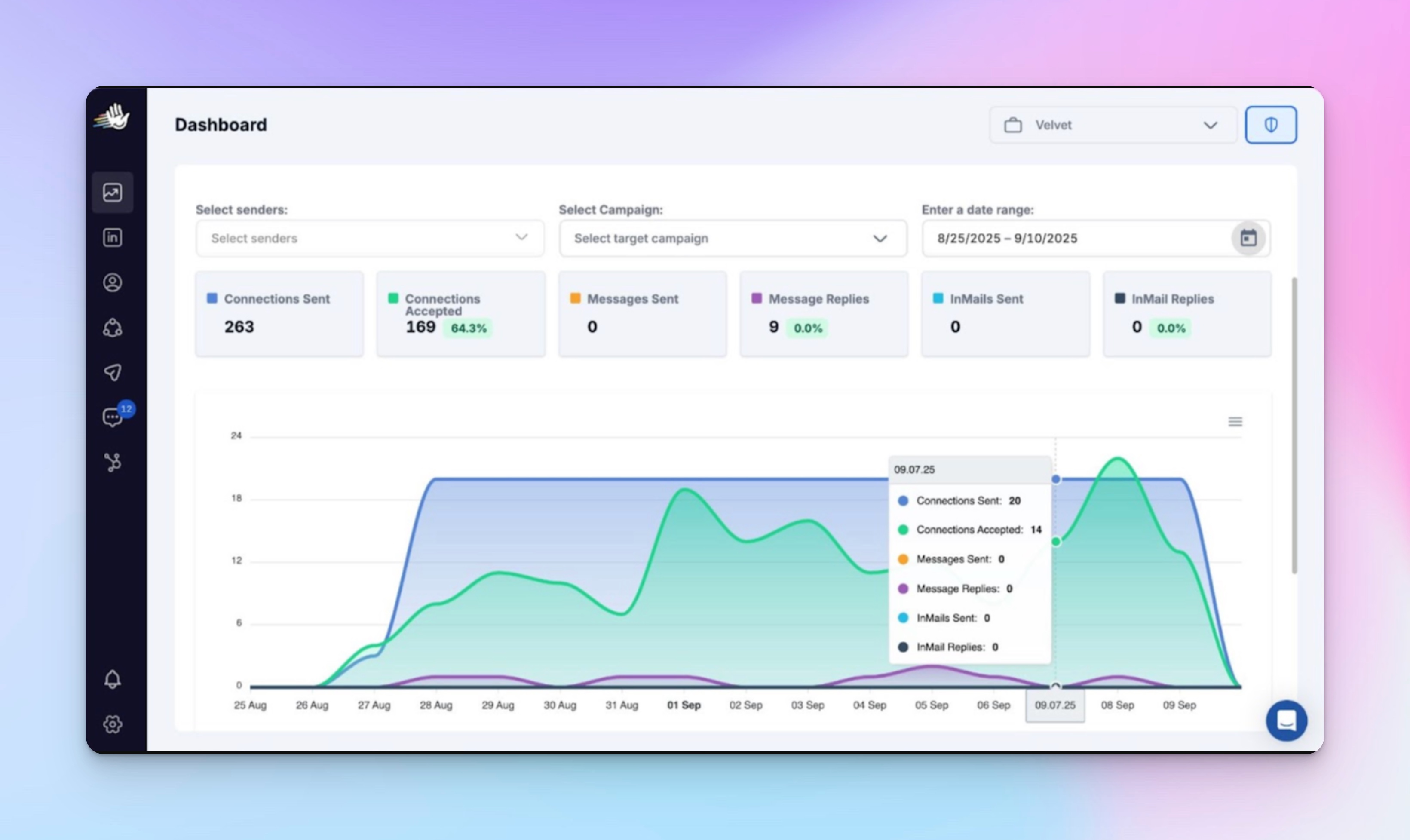
(Unlike website traffic or search engine data, HeyReach focuses on LinkedIn interaction performance only.)
To get this data:
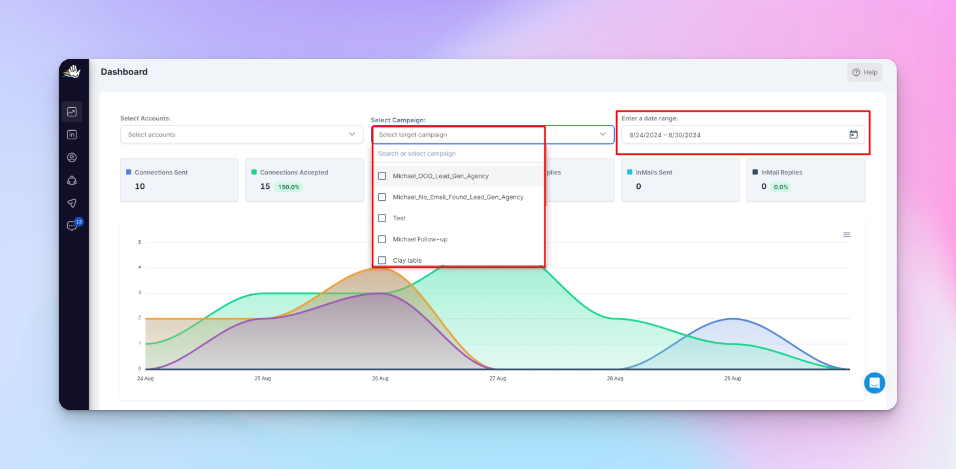
- Go to your HeyReach Dashboard
- Select the specific marketing campaigns you want to analyze (you can pick date ranges too)
- Click Export to CSV
- Save the file with a clear name so you can find it later, like: Campaign_EnterpriseSaaS_Oct2025.csv
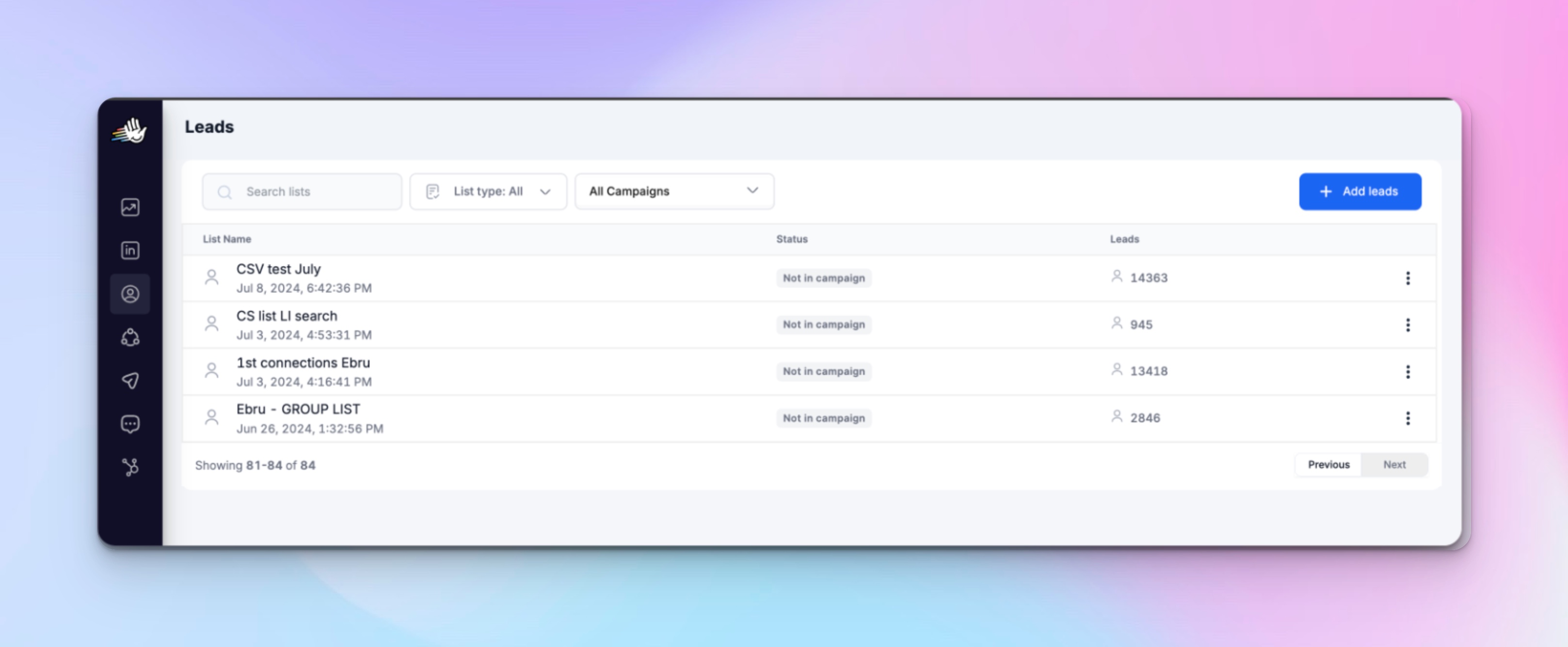
Pro tip: You can also export from the Leads screen (for lead lists) or filter by specific LinkedIn senders before exporting to analyze specific senders or segments separately.
Step 2 — Turn raw metrics into clear decisions everyone agrees on
You’ve got the numbers, now let’s make a system that turns these KPIs into decisions.
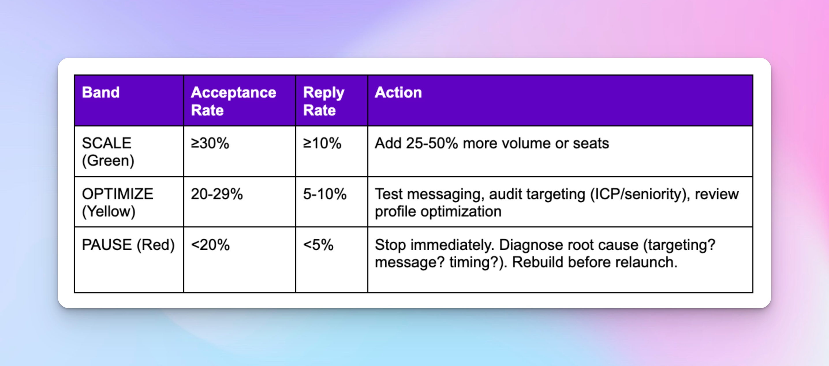
The 3-band framework: Should we scale, optimize, or pause?
It’s a quick play-by-play for RevOps teams to turn acceptance and reply rates into next-week actions; scale green campaigns, tweak yellow, pause red.
(If this were an ad campaign, you'd track cost per lead and ROI; the same logic applies here — you're optimizing for acceptance and replies instead of clicks.)
If you’re thinking, why start at 30 %?
Because that’s the average acceptance rate across B2B and digital marketing outreach. Don't come @ me if your industry is different — that's literally why you adjust after a few cycles.
But seriously, you don’t need to obsess over the number, what matters more is alignment.
When everyone knows that “≥ 30 % = scale” and “< 20 % = pause,” decisions will happen in minutes, not meetings. And that’s exactly how you tie every scale or pause call directly to campaign goals.
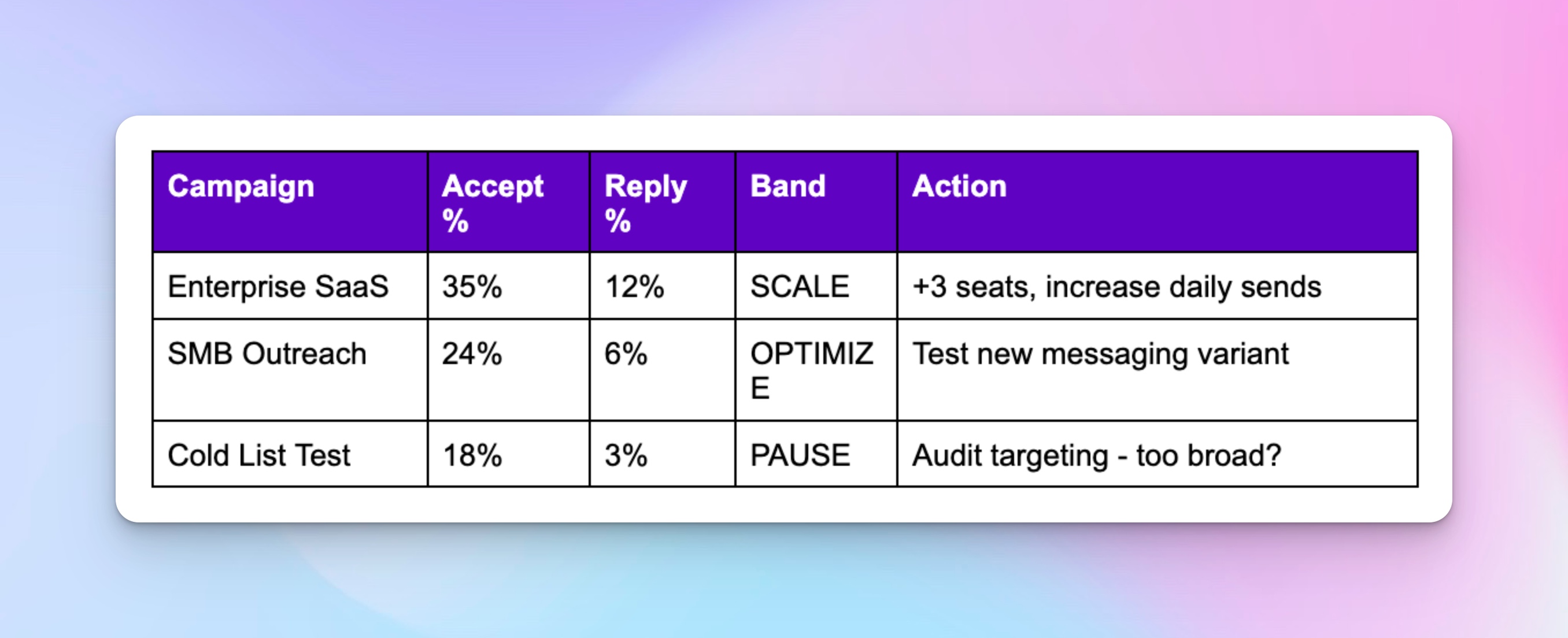
I suggest starting with these benchmarks, then adjust based on your ICP and industry after running a few cycles.
Also, run it manually first. I promise it's not as boring as it sounds 😅
I’ll also show you how to automate this with HeyReach MCP and Claude in the next step, but doing it once yourself will help you understand the rhythm of your campaigns. (Plus you'll appreciate the automation way more.)
Manual audit steps:
- Open your exported CSV from Step 1
- For each campaign, note the acceptance % and reply % (these should already be in your export)
- Assign the band (Scale/Optimize/Pause) based on the thresholds above
- Add an action column that says exactly what you'll do next week
Step 3 — Let AI handle the comparisons so you can focus on marketing strategy
Once you’ve done one manual audit, you’ll already know where things slow down.
This is where you use HeyReach MCP to win back your time.
Instead of:
- Exporting CSVs from multiple campaigns every week
- Building pivot tables to compare performance
- Manually tracking week-over-week changes
- Debating which campaigns deserve more budget
You get a unified snapshot of your overall marketing campaign performance:
- Instant comparative analysis across all campaigns
- Automated Scale / Optimize / Pause checks
- Trend detection without formulas(for quick A/B testing of different message angles or ICP segments)
- Clear, data-backed recommendations you can act on
Just copy one of these ready-to-use prompts and use your AI bestie, ChatGPT or Claude, to get started.
Your first campaign audit might take 10–15 minutes as you get used to the prompts. After that, it’s much faster.
🎥 Watch how Vuk runs this exact workflow in under 10 minutes. (Honestly, watching him do this the first time made me realize I'd been overthinking campaign reviews for months. 🤦♀️)
https://www.youtube.com/embed/dD6SCtXXNtQ?si=eS4Etd2GYjcuw1vP
Copy/paste audit prompts for quick campaign analysis
Prompt 1 – Spot strong vs at-risk campaigns with a health check
Analyze all my active campaigns. Report overall acceptance rate, reply rate, and conversion rates, then classify each as "strong," "needs optimization," or "at risk." Highlight positive/neutral/negative reply distribution and recommend one actionable improvement per underperforming campaign.
Prompt 2 – Find what’s actually driving campaign performance
Review the relationship between lead list quality, message style, and responsiveness. Identify patterns behind top-performing campaigns (message CTR, targeting precision, copy angles) and summarize what targeting or copy adjustments could lift low-performers next cycle.
Prompt 3 – Track momentum and catch campaign performance shifts early
Compare this week’s campaign results with last week’s. Flag any campaigns whose acceptance or reply rates dropped >5 points or improved >10 points. List three likely causes or contributing variables for each change.
Prompt 4 – Share campaign insights with your team
Summarize each campaign’s health in a short update for your team. Include campaign name, acceptance %, reply %, and action band (Scale / Optimize / Pause). Output as a simple table or paragraph you can paste into Slack or your team report.
Bonus prompt — Decide where to invest next week’s seats or budget
Review current campaign performance. If 10 additional LinkedIn seats become available next week, identify which campaigns deserve them and why. Prioritize based on acceptance ≥ 30 %, reply ≥ 10 %, and capacity for scaling without over-messaging the same ICP.
Pro tip: Ask your AI tool to suggest one new call-to-action (CTA) variant to test in your next outreach cycle 😀
Step 4 — Keep your outreach engine self-monitoring with automation
If you're running ≤5 campaigns and checking weekly, Steps 1-3 already give you everything.
But if you're juggling 10+ campaigns or need daily velocity checks, automation stops you from becoming a full-time spreadsheet babysitter.
My rec? Run 3-4 weekly audits by hand. Get comfortable with the pattern: see what changes across touchpoints week to week, which campaigns always need attention, what your team actually cares about in Slack updates.
Then automate the repetitive stuff to streamline your weekly audits.
When automation actually makes sense:
- You're running 10+ campaigns and manual checks eat hours every week
- You need daily velocity checks to catch performance drops fast
- You're okay with a bit of technical setup upfront (or have someone on your team who is)
Automation workflow
The structure is simple: Trigger → Fetch → Logic → Slack
The same structure we use for outbound automation.
You're basically teaching n8n to do what you've been doing manually:
- Pull campaign data from HeyReach on a schedule (weekly works for most teams; adjust the number of times based on campaign velocity)
- Compare each campaign's acceptance % and reply % against your thresholds
- Classify campaigns into Scale/Optimize/Pause bands
- Send a Slack notification to your #campaign-performance channel with the summary
Quick PSA because I care about you 💜: automation ≠ autopilot. That's how AI outreach gets its bad rep (and how LinkedIn accounts end up in timeout).
Think of automation like this: it's your intern who pulls the weekly report. Smart, helpful, but you're still the one deciding what to do with it. Don't ghost your intern. 😅
Automation just handles the grunt work:
- Weekly data pull from HeyReach (no more manual CSV exports)
- Threshold comparisons (is this campaign green, yellow, or red?)
- Slack notifications with campaign health updates
- Historical tracking so you can spot trends over time
You still own the decisions:
- Final pause/scale calls (automation flags issues, you approve action)
- Root cause diagnosis (why did that campaign tank? Automation won't tell you)
- Message testing and ICP refinement (the creative stuff stays yours)
Skip automation if:
- You're managing 5 or fewer campaigns
- Weekly manual reviews feel totally manageable
- Your team's not technical (this isn't plug-and-play)
Here’s a prompt to help you decide whether you need automation or not:
Analyze my last 4 weeks of campaign data. Tell me: (1) how much time I'm spending on manual audits, (2) which campaigns have the most week-to-week volatility, and (3) whether automation would actually save me meaningful time.
Campaign tracker template — for smaller teams before automation
Not ready for MCP or n8n? These trackers do 80% of the job.
Manual spreadsheet versions of the 3-band framework. Both auto-calculate acceptance % and reply %, then classify campaigns as Scale/Optimize/Pause. Set up once (5-10 min), then just paste weekly exports.
Pick your format:
📊 Google Sheets tracker
Pre-configured formulas and color-coding. Export from HeyReach → paste → instant classification.
📋 Notion Tracker
Requires 10-min setup (formula + filtered views), but gives you:
- Three filtered tables: Scale Now, Needs Optimization, Paused for Review
- Optional trend chart to track campaign health over time
- More flexible if your team lives in Notion
Both trackers include:
- Step-by-step setup instructions
- Sample data to test before using
- The same thresholds (≥30% acceptance = scale)
Just copy, run for 3-4 weeks to validate your thresholds, then upgrade to MCP or automation when ready.
Next steps: Run your first audit right now (takes 15 minutes)
You’ve got the framework. You’ve got the prompts.
Now don’t just bookmark this — run your first audit before you close this tab. Here’s your 15-minute action plan:
Connect HeyReach MCP to Claude (≈ 5 min)
Head to your HeyReach MCP and connect to Claude.
Copy Prompt 1 from Step 3
Prompt: “Analyze all active campaigns, classify them as Strong / Needs Optimization / At Risk.”
Paste it into Claude and hit Enter
Let the AI do the math — it’ll review your HeyReach campaign metrics (acceptance %, reply %) and color-code your campaigns using the 3-band framework.
Review your results
Which campaigns are 🟢 green (scale), 🟡 yellow (optimize), or 🔴 red (pause)?
Take 30 seconds to read Claude’s reasoning — it’s the cleanest audit you’ve ever run.
Stop reading, start auditing
One last push from me 💜
You just spent 10 minutes reading this. At the same time, you could run your first audit: export → prompt → decide.
That's it.
Look, I'm not going to tell you this changes everything. It won't. But it will change next Monday's campaign review from a 90-minute debate into a 12-minute standup. And the Monday after that? Even faster.
You'll see your campaigns classified in under 60 seconds.
Then—and this is the part that actually matters—make one decision. Pause a red, add seats to a green, tag a yellow for testing.
Audit complete.
Stop funding losers because "we need more time to see." Start scaling winners before your competitors figure out what you already know.
Try it for free
Frequently Asked Questions
How often should I audit my LinkedIn campaign performance?
Weekly. It takes 15 minutes and stops bad campaigns from burning through another week of budget. Daily is overkill and monthly is too slow—weekly is the sweet spot where you catch problems early but still have enough data to make smart decisions.
What LinkedIn campaign metrics should I track for outreach performance?
You should prioritize Acceptance %, Reply % (or Positive Reply %), Campaign Progress (lead movement), and Lead Volume / Pacing. These directly reflect whether your targeting, messaging, and send cadence are working.
When to pause a campaign vs optimize vs scale it?
Use your 3-band framework: Scale if Acceptance % ≥ 30 % and Reply % ≥ 10 %. Optimize if Acceptance is 20–29 % and Reply is 5–10 %. Pause if Acceptance < 20 % or Reply < 5 %. Pause campaigns that underperform early so they don’t eat up the budget. Optimize the mid-tier ones by testing messaging or targeting tweaks before scaling.
How can I improve my LinkedIn connection acceptance rate?
Optimize your profile, study prospects’ profiles, personalize your note, and target 2nd-degree connections—this combo can help boost your rate. But honestly, the secret is to send 30-45 highly targeted requests instead of 100 generic ones.
.avif)