LinkedIn outreach benchmarks (2025–2026)
Published:
September 17, 2026
Data from 96,051 campaigns run through HeyReach
What does healthy LinkedIn outreach performance actually look like? How does performance shift as campaign volume, sender count, and duration change? And when results fall below the benchmark, where should teams diagnose first?
To find out, we analyzed 96,051 LinkedIn outreach campaigns run through HeyReach over the last 12 months.
We found that typical LinkedIn outreach performance is more stable than most teams assume: the median campaign gets about 1 accepted connection for every 5 requests sent, about 1 reply for every 5 conversations started, and turns about 1 in 5 accepted connections into a reply.
In simple terms, most campaigns aren't failing to get connections; they're failing to turn those connections into replies.
Key takeaways
- 10.7% of campaigns with accepted connections got zero replies — the biggest leak usually shows up after acceptance, not before
- The typical campaign gets about 1 accepted connection for every 5 requests sent
- The typical campaign gets about 1 reply for every 5 conversations started
- Scaling volume slightly lowers acceptance rates, but reply rates stay stable
- Campaigns using 6–20 senders show the strongest reply performance
- Campaigns under 30 days consistently underperform, though duration is correlational, not causal
This gives us a baseline. But the more useful question is where things actually fall apart.
One finding jumps right off the page: 10.7% of campaigns with accepted connections got zero replies.
About the data
All benchmarks come from aggregated campaign activity logged inside HeyReach across 96,051 campaigns. We used three metrics throughout:
- Acceptance rate — how often a connection request gets accepted. Calculated as accepted connections divided by requests sent.
- Reply rate — how often a started conversation gets a reply. Calculated as replies divided by conversations started.
- Reply-to-acceptance conversion — how often an accepted connection turns into a reply. Calculated as replies divided by accepted connections.
These metrics map directly to the outreach flow: you send a request, it gets accepted, a conversation begins, and ideally, a reply comes back.
All benchmarks reflect individual campaign performance, not workspace-level averages.
10.7% of campaigns with accepted connections got zero replies
Put simply: once someone accepts your request, do they actually reply — or does the whole thing stall out there?
Data says that the typical campaign turns only about 1 in 5 accepted connections into a reply. That means the typical campaign turns 18.10% of accepted connections into replies.
So getting accepted isn’t the hard part for many campaigns. Turning that acceptance into an actual reply is.
To see how this varies across campaigns, here’s how reply-to-acceptance conversion breaks down across the dataset:
Campaigns below 9.62% are in weak territory, while stronger-performing campaigns reach 28.89%.
The funnel below shows that the sharpest drop happens after acceptance, when accepted connections fail to turn into replies.
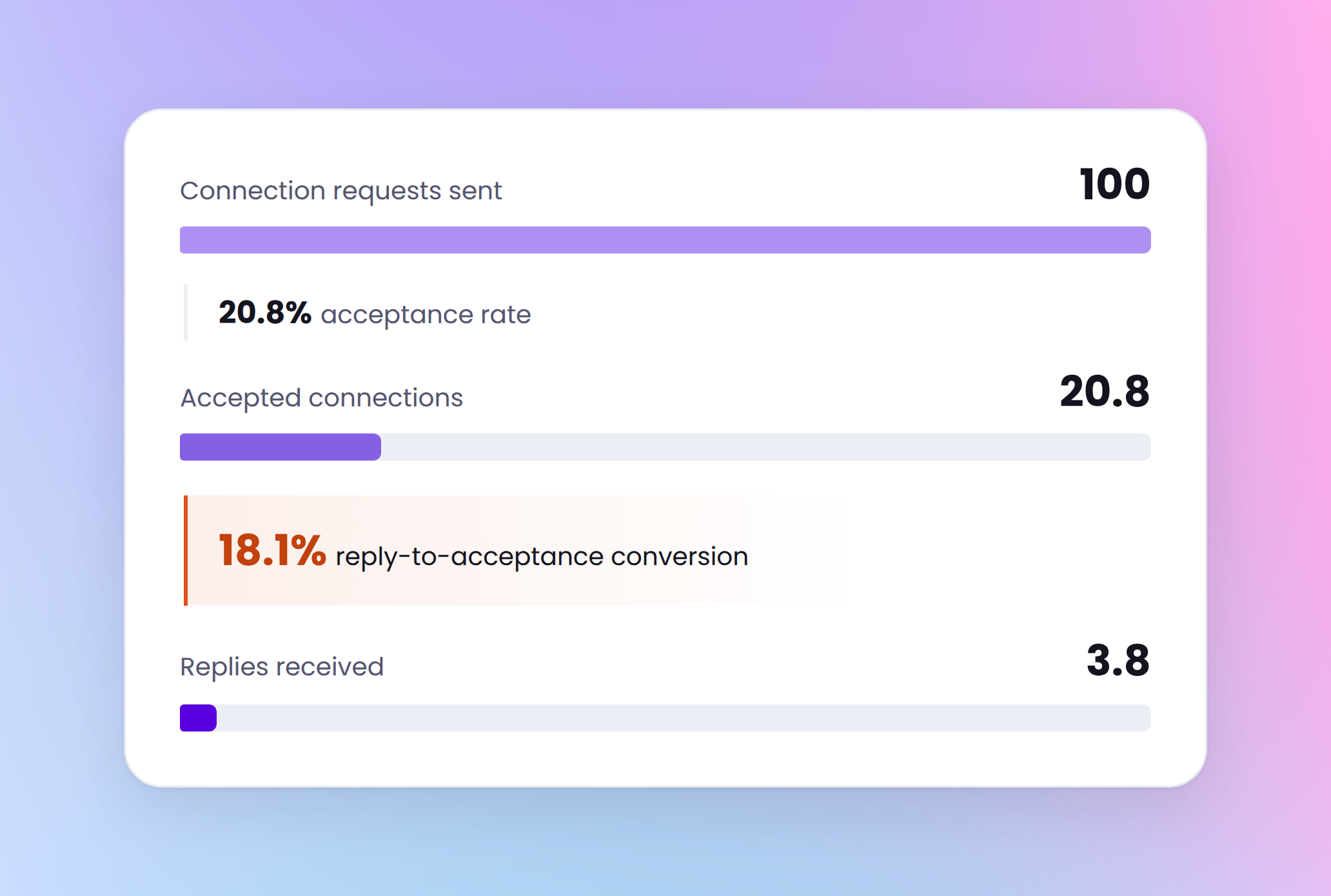
Campaigns can look healthy because acceptance is decent, while still failing to generate replies. That’s the trap.
Most campaigns fall into the middle ranges, but nearly 1 in 10 gets no reply at all
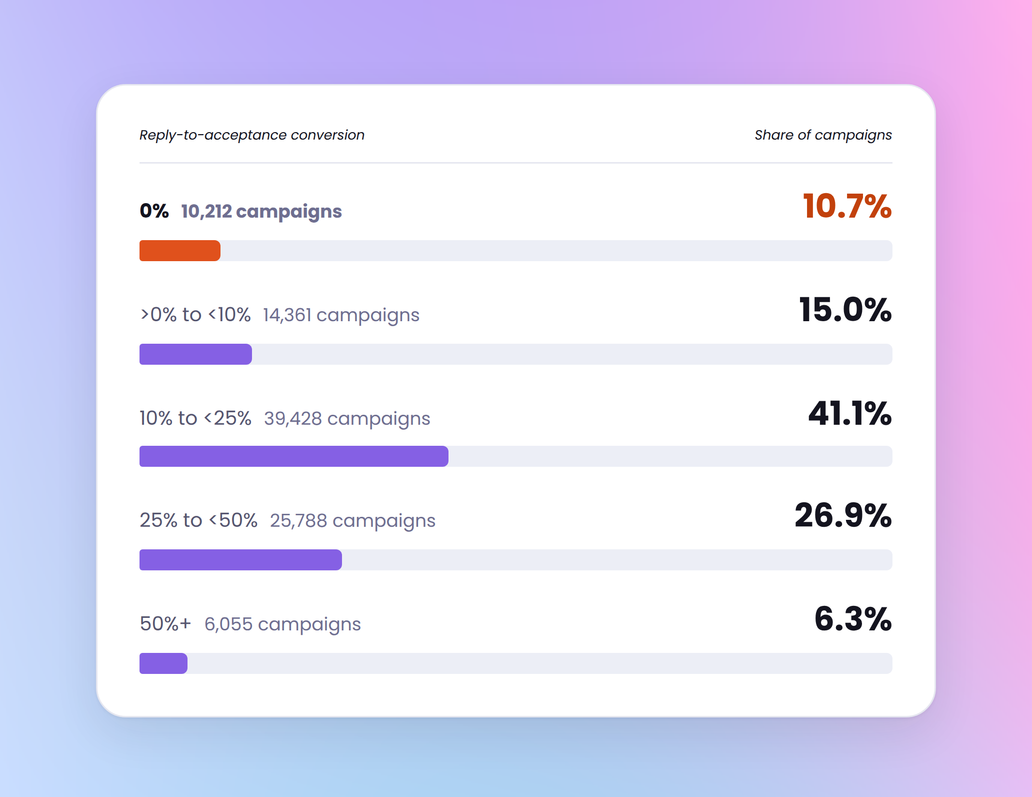
Nearly 11% of campaigns with accepted connections still got zero replies. Another 15% converted fewer than 1 in 10 accepted connections into replies.
That’s not a tiny edge case. That’s a real chunk of campaigns falling apart after the connection gets accepted.
A reply-to-acceptance conversion rate below 9.62% is a strong warning sign — especially when acceptance itself looks healthy.
What to check: Review what happens between the moment someone accepts and the moment you send your first message:
Is the delay too long or too short? Is the connection message, if you use one, doing too much selling before the relationship has even started?
The typical campaign gets 1 accepted connection for every 5 requests sent
Acceptance rate tells you how often prospects accept connection requests. If that number is weak, nothing downstream matters much.
Across the dataset, acceptance-rate benchmarks looked like this:
Most campaigns fall into the middle ranges on acceptance rate, rather than at the very low or very high end. The chart below shows how that plays out across campaigns.
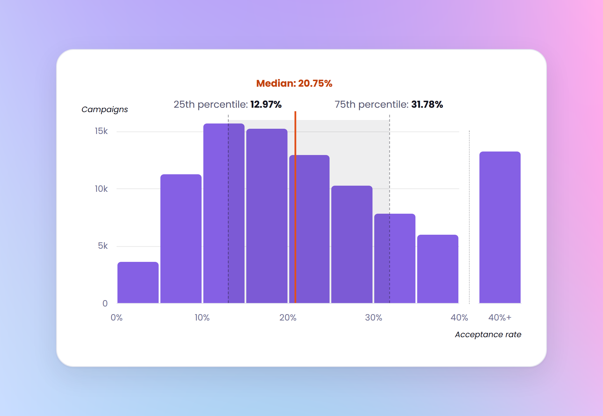
A typical campaign lands at 20.75% acceptance rate. What matters most is not just that benchmark, but how far your results are from it. Stronger-performing campaigns reach 31.78%, which usually points to better ICP fit, stronger sender credibility, or both.
How to read this benchmark:
- Below ~13% → weak acceptance territory
- Around ~21% → typical campaign performance
- Above ~32% → strong acceptance performance
What to check: Review ICP quality, list precision, sender profile completeness, and connection request setup. Don’t start rewriting the message sequence if targeting is still messy. That’s how teams waste a week fixing the wrong problem.
The typical campaign gets 1 reply for every 5 conversations started
Acceptance tells you whether the right people are willing to connect. Reply rate tells you whether your opener is strong enough to keep the ball moving.
Across the dataset, reply-rate benchmarks looked like this:
Most campaigns fall between 15% and 30% on reply rate. The chart below shows what that looks like across the dataset.
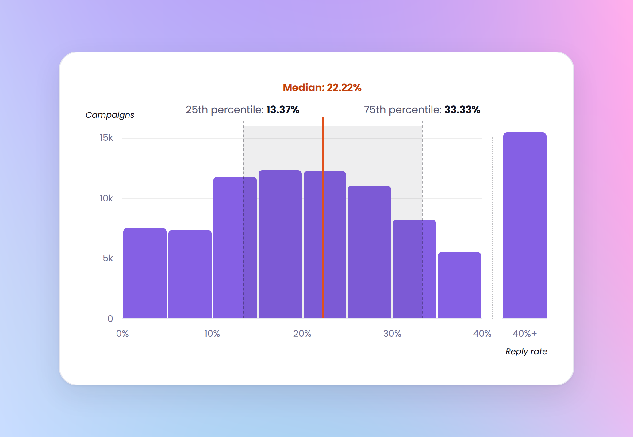
Note: Reply-rate distribution is based on campaigns with at least one started conversation.
Most campaigns fall into the middle ranges, not standout reply performance.
The stronger-performing group clears 33.33%, which usually points to stronger first-message relevance, better timing, or a sharper offer.
How to read this benchmark
- Below ~13% reply rate + below ~13% acceptance rate → likely an ICP or targeting issue
- Below ~13% reply rate + healthy acceptance rate → likely a messaging issue
- Around ~22% → typical campaign performance
- Above ~33% → strong messaging performance
That combination matters. Reply rate alone can mislead you. Pair it with acceptance rate and the picture gets a lot cleaner.
What to check: If reply rate is low and acceptance is healthy, the problem is usually in your first message — the one that opens the conversation after connection.
Check whether it earns a reply on its own merits: is it specific to the person, does it give them a reason to respond, and does it ask one clear question? A first message that jumps straight to what you’re selling before establishing relevance will kill reply rate, even when acceptance is strong.
Acceptance rates decline slightly as campaign volume scales
One of outbound’s favorite myths is that volume automatically wrecks performance. The data says: not really. At least not in the way people usually mean it.
The chart below compares how acceptance and reply rates shift as campaign volume increases.
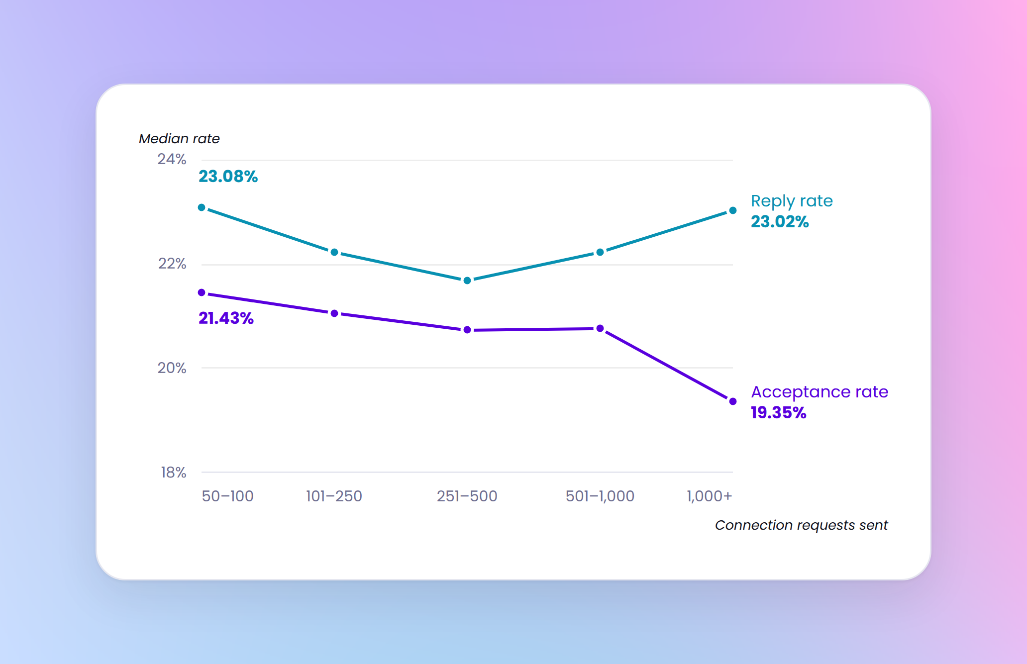
Acceptance declines slightly as campaigns scale, but reply rates stay broadly flat. In other words, scale seems to affect the connection stage more than the conversation stage.
Acceptance drops from 21.43% in the 50–100 bucket to 19.35% in the 1,000+ bucket. That’s real, but not dramatic. Reply rates barely move.
In other words, scale seems to affect the connection stage more than the conversation stage.
So if larger campaigns are underperforming, the first thing to question usually isn’t message copy. It’s more likely ICP looseness, weaker segmentation, lower-fit sender accounts, or list quality slipping as volume rises.
In other words, scale isn’t automatically killing your conversations. It’s more likely exposing that you got sloppier upstream.
What to check: Before rewriting copy, check whether higher-volume campaigns are pulling from broader lists, weaker targeting logic, or lower-fit sender accounts.
Campaigns using 6–20 senders show the strongest reply rates
HeyReach supports campaigns run from one sender or many. To see whether sender count changes outcomes, campaigns were grouped by the number of LinkedIn accounts used.
The chart below shows how reply performance changes as sender count increases.
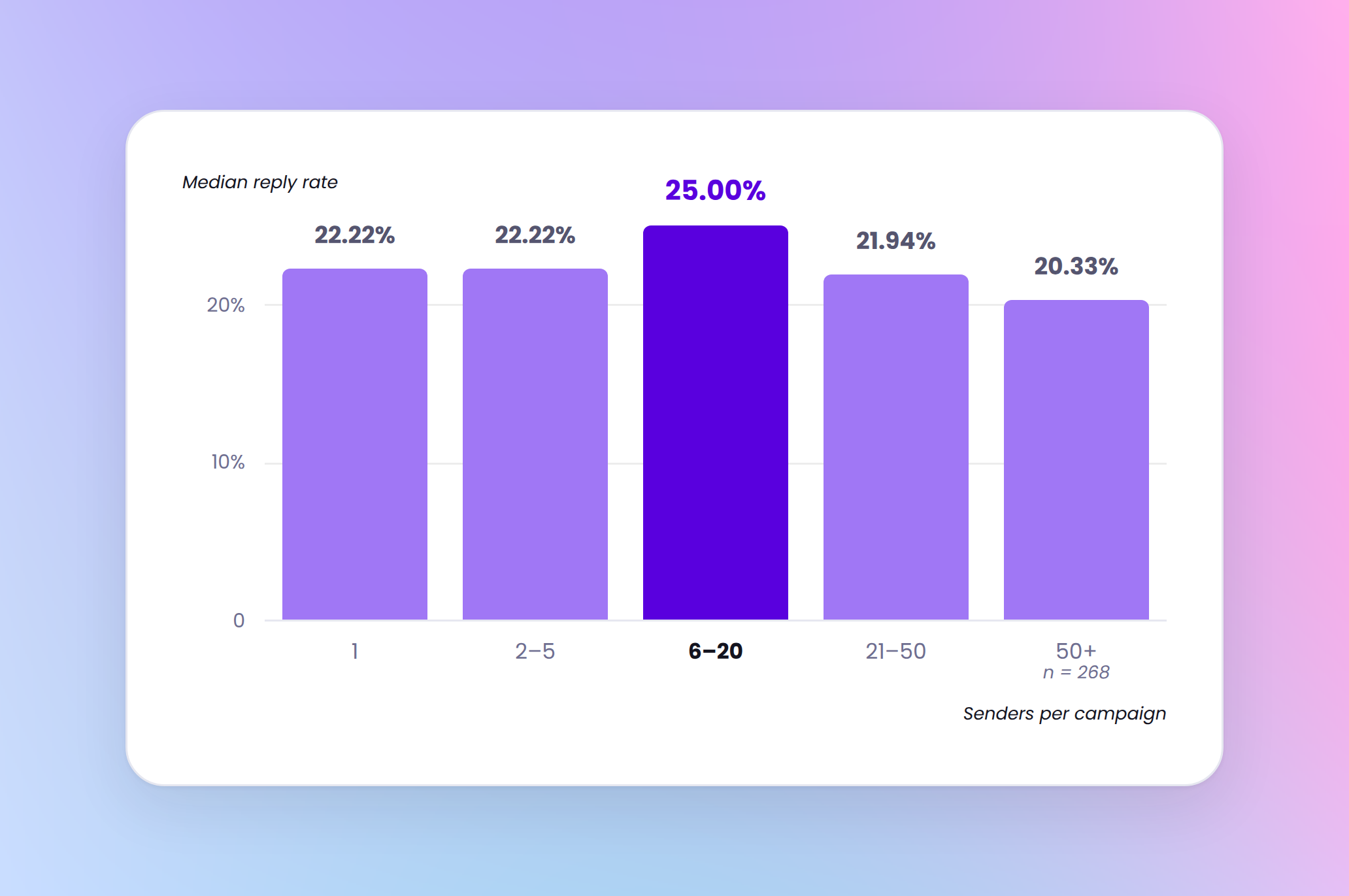
Acceptance rates decline gradually as sender count increases, but the reply pattern is more revealing: moderate multi-sender campaigns outperform both small and very large sender pools.
That doesn’t mean “more senders = better.” It suggests a controlled scale sweet spot — large enough to distribute volume across accounts, but small enough to keep targeting and messaging consistent.
In this dataset, that sweet spot appears to be 6–20 senders.
Caution: The 50+ sender bucket is based on a small sample (268 campaigns) and likely includes more complex agency setups with broader list-quality variation. Treat this bucket as directional, not definitive.
What to check: Review whether sender pools are too broad, whether campaign logic is consistent across accounts, and whether scale is introducing list-quality variation. More seats won’t save a sloppy setup.
Campaigns under 30 days consistently underperform
The chart below shows how acceptance and reply rates change across campaign duration buckets.
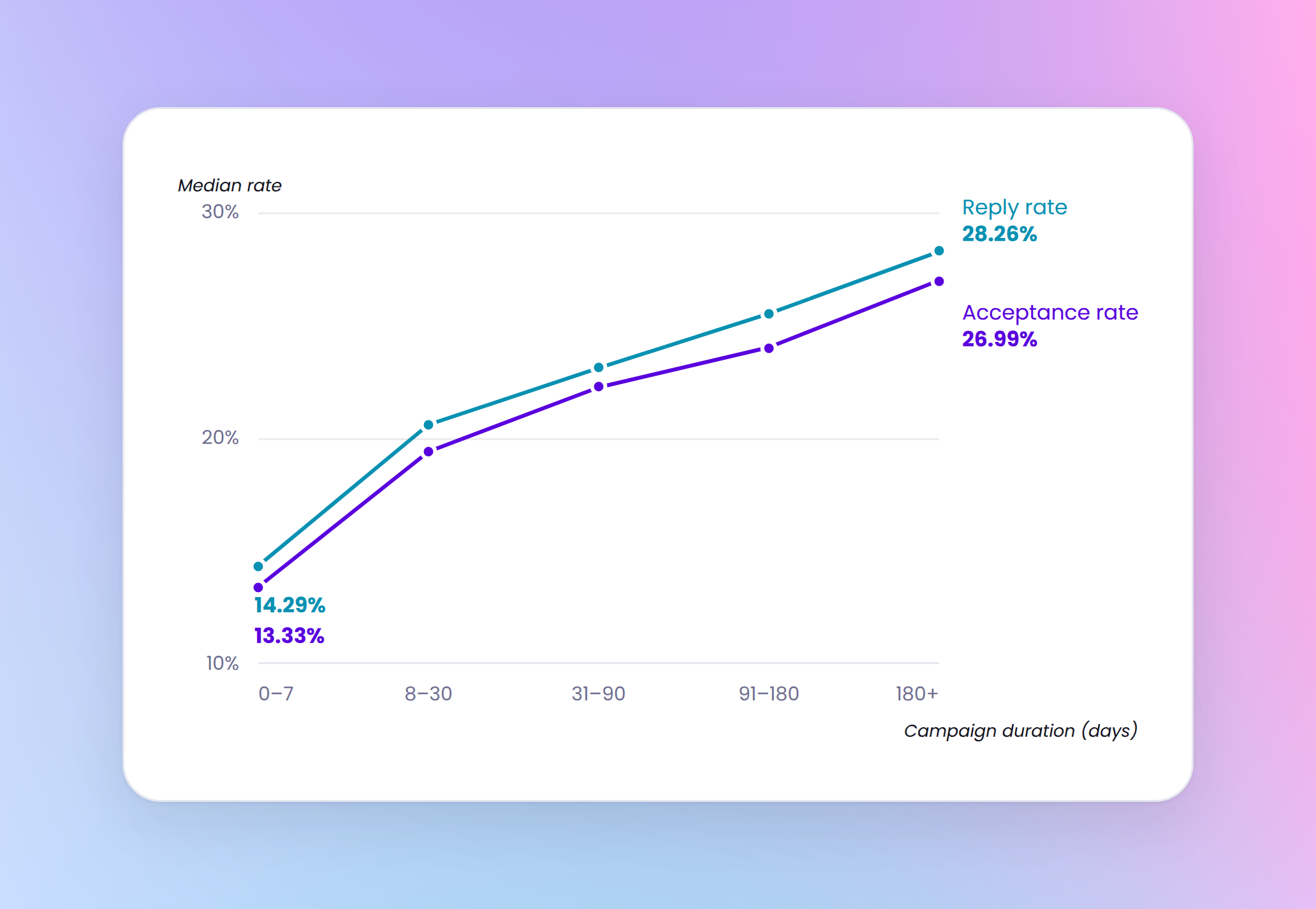
At first glance, longer campaigns perform better across both LinkedIn metrics.
Acceptance rises from 13.33% in the first week to 26.99% in the 180+ day bucket. Reply rates follow the same pattern, climbing from 14.29% to 28.26%.
But this pattern should be read as correlation, not cause and effect. Longer campaigns probably aren’t better because they are longer. They are more likely longer because they were good enough to keep running, while weaker campaigns get paused, reworked, or abandoned.
So the takeaway is not that longer campaigns cause better results. It’s that stronger campaigns are more likely to survive longer.
That still makes duration useful. Campaigns under 30 days consistently underperform. Whether they were weak and got shut down early or never had time to stabilize, short runtime is definitely still a reliable underperformance signal.
What to do with this finding: Use duration as a diagnostic flag, not a direct optimization lever. Don’t keep a weak campaign alive just to “match the benchmark.”
What to fix first
Across 96,051 LinkedIn outreach campaigns, the benchmarks are fairly consistent:
- typical acceptance rate: ~21%
- typical reply rate: ~22%
- typical reply-to-acceptance conversion: ~18%
That gives teams something more useful than anecdotal LinkedIn advice: a real benchmark for what normal performance looks like.
But the bigger insight is where performance actually drops.
The most meaningful drop does not happen when campaigns scale. Acceptance rates decline slightly as volume rises, but reply rates stay broadly stable. The bigger breakdown happens after acceptance, when interest fails to turn into conversation.
10.7% of campaigns with accepted connections got zero replies. That means a meaningful share of campaigns gets through the front door and still goes nowhere.
So if you want a simple order of operations for improving performance, the data suggests this:
- Fix targeting enough to earn the acceptance
- Fix post-acceptance messaging enough to earn the reply
- Then scale
Not the other way around.
Methodology
We analyzed 103,075 campaign rows exported from HeyReach and applied data integrity filters to remove incomplete or inconsistent records. The final benchmark set included 96,051 campaigns.
We excluded:
- Campaigns with no connection requests sent — these contained no measurable outreach activity.
- Campaigns where accepted connections exceeded connection requests sent — these values are logically inconsistent.
- Campaigns where replies exceeded started conversations — these values are also logically inconsistent.
The report uses three core metrics:
- Acceptance rate = accepted connections ÷ connection requests sent
- Reply rate = replies ÷ started conversations
- Reply-to-acceptance conversion = replies ÷ accepted connections
Notes on interpretation
- Reply-rate summaries are based on campaigns with at least one started conversation
- Reply-to-acceptance summaries are based on campaigns with at least one accepted connection
- Campaign volume was analyzed using connection requests sent
- Campaign duration was calculated using the elapsed time between the earliest and latest campaign timestamps

Try it for free